Pros:
2 extra weekly spots for pictures
less paper use
I'm able to add random verses or prompts without fear of leaving a picture out
I'm noticing there is much need to use an inset, everything fits
Cons:
there is less spots to put embellishments on (a square pic on a 4x6 card= embellishments!)
I own ALOT of Project Life cards, and not all title cards are cuttable
I feel my layouts end up looking more bland
So, with the pros and cons, it's been a challenge deciding wether to stick with the new design or, work my Design A back in. To date all of my previous Project Life years have consisted of 3 albums, and sometimes it's been hard to get them to fit with 3! I have opted to omit things to make it fit better. With that being said, my girls are getting older, and their hobbies have changed, are they are doing more with others and I don't get pictures, so there are less things I'm trying to include. We shall see if I stick with Design K as time goes on.
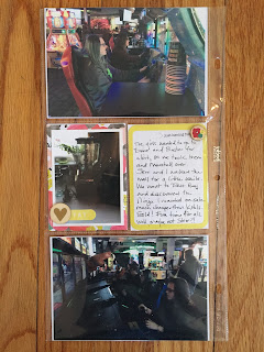
This is another " Collection Challenge" i am doing with my friend Melissa, we are both using Dear Lizzy Documentary, and showing two different takes on the same collection. You can find her here .I decided to add the first couple days of January into the first solid week and make it one. I also will insert my One Little Word sheet which discussess "Change". Im back to Weight Watchers and the gym, cooking and eating healthy and weeding out. We had my nephews birthday get together and a trip to Dave and Busters with the girls and Marshall, so that is a small insert. So without further ado, her is my first week full view.
The front side of my insert is my nephew birthday get together.
The back side of the insert is the kids at Dave and Busters.
Here is the left side for closer view. My daughter got my husband the nutribullet for Christmas, so we are all trying out new drinks. I normally put the week number on my title cards, but as a kitten foster, this card just screamed to me, so I just put the dates.
Here is a close up of the right side. Just some random things from the second half of the week. Steve with his "baby" We have 10 kitties, so you will see alot of kitty pics on this blog! The heart card was handed out at Weight Watchers. Loving the squirrel pic, we have a little ledge on the front door, and he just sat there watching me, food in mouth.
Ok, so i hope you enjoyed this layout, comments are always welcome. Id love to see your take on it. Dont forget to head on over to Melissa's blog and see her take on the collection.


3 comments:
I just found your blog from Melissa's blog, and I am so happy to have found a few more people posting their PL pages! I am not new to PL as I have been following it for some time now, but I only really started doing PL pages a few months ago. I am now a follower and look forward to seeing more of it, along with your other scrappy pages!
Thank you so much Lori! I'm glad you like my blog. Let me know if there is anything you'd like to see, I'm always open for suggestions!
Great layoit Michelle. It's refreshing to see a new page layout besides the standard "Design A" that is so common!
Post a Comment